Switch
A toggle switch component with animated color transitions, styled for the SMAC design system.
Usage
import { Switch} from '@smartacteam/react-native-ui';
<Switch
  selected={...}
  onChange={(val) => ...}
/>
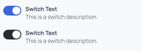
Example
Props
| Prop | Type | Required | Description |
|---|---|---|---|
label | string | No | Main label text displayed next to the switch. |
description | string | No | Secondary description shown below the label. |
selected | boolean | Yes | Whether the switch is currently active/on. |
onChange | (value: boolean) => void | No | Callback triggered when the switch toggles. |
color | keyof GlobalColorsType | No | Background color when switch is inactive. |
activeColor | keyof GlobalColorsType | No | Background color when switch is active. |
labelFontWeight | TextWeight | No | Font weight for the label (e.g., semibold, medium). |
...TouchableOpacityProps | React Native touch props | No | Any additional props passed to the underlying Pressable wrapper. |
...BaseSmacStyling | SMAC utility styling props | No | Support for margin/padding/styling via design tokens. |