Select
A customizable dropdown select component with animated feedback, search capabilities, and flexible styling options.
Usage
import { Select } from '@smartacteam/react-native-ui';
<Select
  placeholder="Choose an option"
  label="Category"
  value={selectedValue}
  onChange={setSelectedValue}
>
  <Select.Item label="Option 1" value="option1" />
  <Select.Item label="Option 2" value="option2" />
  <Select.Item label="Option 3" value="option3" />
</Select>
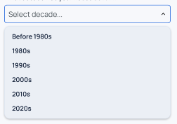
Example
Props
Select Props
| Name | Type | Required | Description |
|---|---|---|---|
children | React.ReactElement<ItemProps>[] | Yes | Array of Select.Item components that define the dropdown options. |
onChange | (val: any) => void | No | Callback function called when a selection is made. |
value | Value | No | Currently selected value that matches one of the item values. |
label | string | No | Label displayed above the select component. |
searchbar | boolean | No | Adds search bar to select. |
formName | string | No | Optional identifier for form integration |
description | string | No | Helper or error description displayed below the select. |
error | boolean | No | Displays error styling if true. |
disabled | boolean | No | Disables the select and changes its style accordingly. |
placeholder | string | No | Placeholder text shown when no value is selected. |
leftComponent | React.ReactNode | No | Custom element rendered to the left of the select container. |
rightComponent | React.ReactNode | No | Custom element rendered to the right of the select container. |
startPrefix | React.ReactNode | No | Element rendered inside the select at the start (left side). |
endPrefix | React.ReactNode | No | Element rendered inside the select at the end (right side). Defaults to chevron icon. |
container_* | BaseSmacStyling | No | Prefixed props that apply styles to the outer container (e.g. container_mt_4). |
onFocus | (e: any) => void | No | Callback called when the dropdown opens. |
onBlur | (e: any) => void | No | Callback called when the dropdown closes. |
| (Inherited) | BaseSmacStyling | No | All base SMAC styling props. |
Select.Item Props
| Name | Type | Required | Description |
|---|---|---|---|
value | Value | Yes | The value associated with this item. |
label | string | No | Display text for the item. |
onChange | (val: Value) => void | No | Callback function (automatically passed by parent Select). |
selected | boolean | No | Whether this item is currently selected (automatically determined). |
| (Inherited) | ButtonProps | No | All Button component props are available. |
Features
- Animated Interactions: Smooth chevron rotation and border color transitions
- Error States: Automatic border and description color changes for validation feedback
- Flexible Styling: Support for both default and chat-style appearances
- Custom Components: Add left/right components and start/end prefixes
- Scrollable Menu: Dropdown menu with scroll support for long option lists
- Accessibility: Built on top of accessible button and dropdown components
The dropdown menu automatically adjusts its width to match the select button and has a maximum height of 240 pixels with scrolling enabled.
Error state triggers animated border and description color changes similar to the Input component.
Style props prefixed with
container_apply to the root wrapper<View>around the entire select component.
See
BaseSmacStylingandButtonPropsfor additional inherited styling options.