Radio Group
The `Radio` component is used to select a single option from a list of options. It consists of `Radio.Group` and `Radio.Item`.
Usage
import { Radio } from '@smartacteam/react-native-ui';
<Radio.Group
  value={value}
  onChange={setValue}
  description="Select your preferred option"
>
  <Radio.Item value="option1" label="First Option" />
  <Radio.Item value="option2" label="Second Option" description="This is additional info" />
  <Radio.Item value="option3" label="Third Option" />
</Radio.Group>
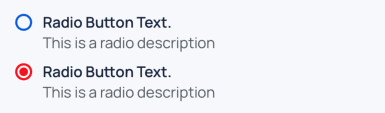
Example
Radio.Group Props
| Prop | Type | Description |
|---|---|---|
children | ReactElement<ItemProps>[] | A list of Radio.Item components |
value | any | Currently selected value |
formName | string | Optional identifier for form integration |
error | boolean | If true, shows the description text in error color |
description | string | Text below the group; animates color based on error |
onChange | (value: Value) => void | Called when a Radio.Item is selected |
style | ViewStyle | Custom styles for the container |
Radio.Item Props
| Prop | Type | Description |
|---|---|---|
label | string | Text label shown for this item |
description | string | Optional smaller text below the label |
value | any | Value represented by this radio item |
selected | boolean | Controlled by Radio.Group; indicates if item is selected |
onSelect | (value: Value) => void | Called when the item is pressed |
color | keyof GlobalColorsType | Optional color override for selected state |
labelFontWeight | TextWeight | Controls font weight of label text |
style | TouchableOpacityProps | Additional style props |