Usage
import { Input } from '@smartacteam/react-native-ui';
<Input
  placeholder="Enter your username"
  label="Username"
  value={...}
  onChangeText={...}
/>
Example
Props
| Name | Type | Required | Description |
|---|---|---|---|
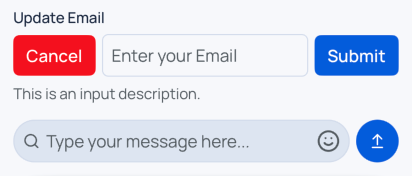
label | string | No | Label displayed above the input. |
description | string | No | Helper or error description displayed below the input. |
error | boolean | No | Displays error styling if true. |
formName | string | No | A name for input used in Form. |
disabled | boolean | No | Disables the input and changes its style accordingly. |
leftComponent | React.ReactNode | No | Custom element rendered to the left of the input container. |
rightComponent | React.ReactNode | No | Custom element rendered to the right of the input container. |
startPrefix | React.ReactNode | No | Element rendered inside the input at the start (left side). |
endPrefix | React.ReactNode | No | Element rendered inside the input at the end (right side). |
type | 'default' | 'chat' | No | Modifies styling of the input. chat style has more rounded borders. |
container_* | BaseSmacStyling | No | Prefixed props that apply styles to the outer container (e.g. container_mt_4). |
| (Inherited) | TextInputProps & BaseSmacStyling | No | All standard React Native TextInput props and base SMAC styling. |
Error state triggers border and description color animations.
Style props prefixed with
container_apply to the root wrapper<View>around the entire input component.
See
BaseSmacStylingand TextInputProps for inherited options.