Checkbox
The `Checkbox` component allows selecting multiple options from a list. It consists of `Checkbox.Group` and `Checkbox.Item`.
Usage
import { Checkbox } from '@smartacteam/react-native-ui';
<Checkbox.Group
  value={selectedValues}
  onChange={setSelectedValues}
>
  <Checkbox.Item value="beans" label="Beans" />
  <Checkbox.Item value="sausage" label="Sausage" />
  <Checkbox.Item value="cheese" label="Parmesan" />
  <Checkbox.Item value="olive" label="Olives" />
  <Checkbox.Item value="sardine" label="Sardines" />
</Checkbox.Group>
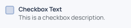
Example
Checkbox.Group Props
| Prop | Type | Description |
|---|---|---|
children | React.ReactElement<ItemProps>[] | List of Checkbox.Item components |
value | Array<any> | Array of selected values |
formName | string | Optional identifier for form integration |
error | boolean | If true, shows description text in error color |
description | string | Text shown below the group; animates color depending on error state |
onChange | (value: Array<any>) => void | Callback fired when the selection changes |
style | ViewProps['style'] | Custom styles for the container |
Checkbox.Item Props
| Prop | Type | Description |
|---|---|---|
label | string | Label text displayed next to the checkbox |
description | string | Optional smaller description text below the label |
selected | boolean | Controlled selected state, usually passed from Checkbox.Group |
value | any | Value represented by this checkbox item |
color | keyof GlobalColorsType | Optional color key for the checkbox border and fill when not selected |
activeColor | keyof GlobalColorsType | Optional color key for the checkbox fill when selected |
labelFontWeight | TextWeight | Font weight of the label text |
onChange | (selected: boolean, value?: any) => void | Callback fired when this checkbox is toggled |
style | TouchableOpacityProps['style'] | Additional style props |
Notes
- Use
Checkbox.Groupto manage the list of selected values and pass them down asvalueprop. Checkbox.Itemcan be used standalone, but typically controlled byCheckbox.Group.- The component uses animated color transitions to indicate error state and selection.
formNameprop inCheckbox.Groupcan be used for integration withForm.