Badge
Badges show notifications, counts, or status information. They are compact and discreet — designed to be minimal and non-intrusive.
Usage
import {Badge} from '@smartacteam/react-native-ui';
<Badge
  variant="primary"
  label="On Hold"
  outline
  onPress={()=> {...}}
  leftIcon='...icon'
/>
Example
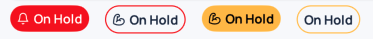
Props
| Name | Type | Required | Description |
|---|---|---|---|
variant | 'primary' | 'secondary' | 'confirmation' | 'warning' | 'destructive' | No | Visual style of the badge. |
label | string | No | Badge label. |
outline | boolean | No | Badge style, default is false. |
leftIcon | IconName | No | The icon prop must be one of icons |
label_* | BaseSmacTextStyling | No | Text style overrides for the label, e.g. label_fontSize, label_fontWeight. |
onPress | () => void | No | Badge action (if needed). |
| (…) | (Inherited) | Props from BaseSmacStyling, ViewProps. |
See
BaseSmacStylingand React Native View Props for inherited options.